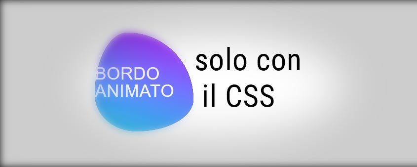
Come animare il “border-radius” solo con il css
Buongiorno a tutti cari, oggi finalmente è venerdì e in casa Visual Art, il venerdì è il giorno dei tutorial.
Oggi andremo a realizzare un effetto a mio avviso spettacolare, ossia il "morphing" tramite CSS3 puro, quindi senza l'uso di jquery, animando il "border-radius".
Come al solito puoi vedere una demo cliccando QUI, mentre per scaricare il tutorial clicca QUI.
Iniziamo!
Come primo step, apriamo il nostro editor preferito, ed oltre a scrivere la sintassi base dell' html5, inseriremo anche un div con all'interno un tag titolo, oppure quello che preferite (previa adattamento dello stile css che vedremo in seguito).
Ecco un codice di Esempio:
<!doctype html>
<html>
 <head>
  <meta charset="utf-8">
  <title>Come animare il border-radius solo con il css</title>
 </head>
 <body>
    <div>
      <h1>Bordo Animato</h1>
    </div>
</body>
</html>
Una volta fatto tra i tag <style> del nostro documento, oppure meglio se in un file css, nel quale avete scritto tutto lo stile della vostra pagina inseriremo il codice per creare l'animazione:
/*Stile Generale*/
body {
    width: 100%;
    height: 100%;
    min-height: 100vh;
    display: flex;
    align-content: center;
    align-items: center;
    justify-content: center;
    margin: 0;
    background: #282828;
}
/*Stile del contenitore dell'animazione*/
div {
    display: flex;
    align-content: center;
    align-items: center;
    justify-content: center;
    width: 200px;
    height: 200px;
    margin: auto;
    background-color: #21d4fd;
    background-image: linear-gradient(19deg, #21d4fd 0%, #b721ff 100%);
    border-radius: 30% 70% 70% 30%/30% 30% 70% 70%;
    box-shadow: 15px 15px 50px rgba(0,0,0,0.2);
    animation: anima_bordo 10s infinite;
    overflow: hidden;
}
/*Blocco l'animazione sul mouse Hover */
div:hover {
    animation-play-state: paused;
}
/*Stile del contenuto testuale*/
div h1 {
    color: #fff;
    font-family: Helvetica Neue, Helvetica, Verdana, sans-serif;
    font-weight: 400;
    font-size: 35px;
    line-height: 100%;
    text-transform: uppercase;
    letter-spacing: 0.02em;
    margin: auto;
}
/*Si parte con la creazione dell'animazione anima_bordo*/
/*Mozilla Firefox*/
@-moz-keyframes anima_bordo {
 0% {
 border-radius: 30% 70% 70% 30%/30% 30% 70% 70%;
 box-shadow: 15px 15px 50px rgba(0,0,0,0.2);
}
 25% {
 border-radius: 58% 42% 75% 25%/76% 46% 54% 24%;
}
 50% {
 border-radius: 50% 50% 33% 67%/55% 27% 73% 45%;
 box-shadow: -10px -5px 50px rgba(0,0,0,0.2);
}
 75% {
 border-radius: 33% 67% 58% 42%/63% 68% 32% 37%;
}
}
/*Browser basati su Webkit*/
@-webkit-keyframes anima_bordo {
 0% {
 border-radius: 30% 70% 70% 30%/30% 30% 70% 70%;
 box-shadow: 15px 15px 50px rgba(0,0,0,0.2);
}
 25% {
 border-radius: 58% 42% 75% 25%/76% 46% 54% 24%;
}
 50% {
 border-radius: 50% 50% 33% 67%/55% 27% 73% 45%;
 box-shadow: -10px -5px 50px rgba(0,0,0,0.2);
}
 75% {
 border-radius: 33% 67% 58% 42%/63% 68% 32% 37%;
}
}
/*Opera*/
@-o-keyframes anima_bordo {
 0% {
 border-radius: 30% 70% 70% 30%/30% 30% 70% 70%;
 box-shadow: 15px 15px 50px rgba(0,0,0,0.2);
}
 25% {
 border-radius: 58% 42% 75% 25%/76% 46% 54% 24%;
}
 50% {
 border-radius: 50% 50% 33% 67%/55% 27% 73% 45%;
 box-shadow: -10px -5px 50px rgba(0,0,0,0.2);
}
 75% {
 border-radius: 33% 67% 58% 42%/63% 68% 32% 37%;
}
}
/*Sintassi standard W3C*/
@keyframes anima_bordo {
 0% {
 border-radius: 30% 70% 70% 30%/30% 30% 70% 70%;
 box-shadow: 15px 15px 50px rgba(0,0,0,0.2);
}
 25% {
 border-radius: 58% 42% 75% 25%/76% 46% 54% 24%;
}
 50% {
 border-radius: 50% 50% 33% 67%/55% 27% 73% 45%;
 box-shadow: -10px -5px 50px rgba(0,0,0,0.2);
}
 75% {
 border-radius: 33% 67% 58% 42%/63% 68% 32% 37%;
}
}
Il codice è semplicissimo, è cross-browsing ed è anche commentantato.
Quello che abbiamo fatto è stato creare un'animazione di nome "anima_bordo" mediante l'uso dei keyframes, modificando di volta in volta il "border-radius" del contenitore.
Ecco a voi il codice completo:
<!doctype html>
<html>
	<head>
	<meta charset="utf-8">
	<title>Come animare il border-radius solo con il css</title>
	<style>
/*Stile Generale*/
body {
    width: 100%;
    height: 100%;
    min-height: 100vh;
    display: flex;
    align-content: center;
    align-items: center;
    justify-content: center;
    margin: 0;
    background: #282828;
}
/*Stile del contenitore dell'animazione*/
div {
    display: flex;
    align-content: center;
    align-items: center;
    justify-content: center;
    width: 200px;
    height: 200px;
    margin: auto;
    background-color: #21d4fd;
    background-image: linear-gradient(19deg, #21d4fd 0%, #b721ff 100%);
    border-radius: 30% 70% 70% 30%/30% 30% 70% 70%;
    box-shadow: 15px 15px 50px rgba(0,0,0,0.2);
    animation: anima_bordo 10s infinite;
    overflow: hidden;
}
/*Blocco l'animazione sul mouse Hover */
div:hover {
    animation-play-state: paused;
}
/*Stile del contenuto testuale*/
div h1 {
    color: #fff;
    font-family: Helvetica Neue, Helvetica, Verdana, sans-serif;
    font-weight: 400;
    font-size: 35px;
    line-height: 100%;
    text-transform: uppercase;
    letter-spacing: 0.02em;
    margin: auto;
}
/*Si parte con la creazione dell'animazione anima_bordo*/
/*Mozilla Firefox*/
@-moz-keyframes anima_bordo {
 0% {
 border-radius: 30% 70% 70% 30%/30% 30% 70% 70%;
 box-shadow: 15px 15px 50px rgba(0,0,0,0.2);
}
 25% {
 border-radius: 58% 42% 75% 25%/76% 46% 54% 24%;
}
 50% {
 border-radius: 50% 50% 33% 67%/55% 27% 73% 45%;
 box-shadow: -10px -5px 50px rgba(0,0,0,0.2);
}
 75% {
 border-radius: 33% 67% 58% 42%/63% 68% 32% 37%;
}
}
/*Browser basati su Webkit*/
@-webkit-keyframes anima_bordo {
 0% {
 border-radius: 30% 70% 70% 30%/30% 30% 70% 70%;
 box-shadow: 15px 15px 50px rgba(0,0,0,0.2);
}
 25% {
 border-radius: 58% 42% 75% 25%/76% 46% 54% 24%;
}
 50% {
 border-radius: 50% 50% 33% 67%/55% 27% 73% 45%;
 box-shadow: -10px -5px 50px rgba(0,0,0,0.2);
}
 75% {
 border-radius: 33% 67% 58% 42%/63% 68% 32% 37%;
}
}
/*Opera*/
@-o-keyframes anima_bordo {
 0% {
 border-radius: 30% 70% 70% 30%/30% 30% 70% 70%;
 box-shadow: 15px 15px 50px rgba(0,0,0,0.2);
}
 25% {
 border-radius: 58% 42% 75% 25%/76% 46% 54% 24%;
}
 50% {
 border-radius: 50% 50% 33% 67%/55% 27% 73% 45%;
 box-shadow: -10px -5px 50px rgba(0,0,0,0.2);
}
 75% {
 border-radius: 33% 67% 58% 42%/63% 68% 32% 37%;
}
}
/*Sintassi standard W3C*/
@keyframes anima_bordo {
 0% {
 border-radius: 30% 70% 70% 30%/30% 30% 70% 70%;
 box-shadow: 15px 15px 50px rgba(0,0,0,0.2);
}
 25% {
 border-radius: 58% 42% 75% 25%/76% 46% 54% 24%;
}
 50% {
 border-radius: 50% 50% 33% 67%/55% 27% 73% 45%;
 box-shadow: -10px -5px 50px rgba(0,0,0,0.2);
}
 75% {
 border-radius: 33% 67% 58% 42%/63% 68% 32% 37%;
}
}
</style>
	</head>

	<body>
    <div>
      <h1>Bordo Animato</h1>
    </div>
</body>
</html>
Spero che questo breve tutorial possa essere stato di vostro gradimento non solo per realizzare questo, a mio avviso, bellissimo effetto, ma per farvi capire quante bellissime cose si possono fare con del semplice CSS.
Vi saluto e vi aspetto per il prossimo articolo sul Blog!
Ciao a tutti